Table of Contents
Why social media image sizes 2026 matter more than you think
Wrong dimensions cost campaigns. A great visual cropped at the wrong ratio looks amateur. A LinkedIn post sized for Instagram gets buried in the feed. A Meta ad with the headline cropped off the bottom burns budget for zero clicks.
The right social media image sizes 2026 are the ones that match the current native ratios of each platform. Platforms quietly adjust these every year. Pixel dimensions shift. Safe zones move. What ranked in your feed last year might be cropped today.
This guide is the working cheat sheet I use on retainer for marketing teams. Every dimension here is one I have shipped into production this year, across SaaS, B2B, and event clients. No filler. No guesses.
Quick answer: For most platforms in 2026, design vertical (4:5 or 9:16) for social feeds, square (1:1) for ads, and landscape (16:9) for video and slides. The exact pixels are below.
How to use this cheat sheet
Three rules before you open Figma:
- Design at the largest size first. It is easier to scale a 1080 × 1350 LinkedIn post down to an Instagram Story than to scale up a 600 × 300 email banner.
- Keep a 10 percent safe zone on every edge. Platforms crop differently on mobile vs desktop. Text near the edge gets cut.
- Export at 2x for high-DPI screens. Retina displays still exist. Blurry creatives look cheap.
If you are part of an in-house marketing team and your designer is overloaded, this is the kind of work that ends up wrong, late, or skipped. A working retainer fixes that — more on how I support marketing teams.
Social media image sizes (LinkedIn, Instagram, X)
Social feeds are the most visible surface for any brand. Get the dimensions right and your visual fills the screen. Get them wrong and your post looks small, cropped, or off-brand.
LinkedIn post size: 1080 × 1350 pixels
LinkedIn rewards vertical content in 2026. The 4:5 ratio at 1080 × 1350 pixels takes up the most feed real estate on mobile, where the majority of LinkedIn scrolling happens.
Use this size for single-image posts, quote cards, and announcement graphics. According to LinkedIn’s 2024 algorithm research from Richard van der Blom, taller posts consistently get higher dwell time, which feeds engagement.
Actionable tip: Place your hook in the top two-thirds of the image. The bottom third often gets clipped in the preview before someone taps “see more.”
LinkedIn carousel (document post): 1080 × 1350 pixels
Same dimensions as a single post, exported as a multi-page PDF. Carousels are the highest-performing format on LinkedIn for B2B content right now.
Keep slides scannable. One idea per slide. No more than 12 slides total — engagement drops sharply after that.
Instagram post (4:5 vertical): 1080 × 1440 pixels
The 4:5 ratio at 1080 × 1440 pixels is the largest format Instagram allows in the feed. Square posts (1:1) still work, but vertical posts get more screen space and higher reach.
Use this for product shots, branded quote graphics, and high-intent feed posts where you want maximum thumb-stop.
Instagram Story and Reel: 1080 × 1920 pixels
The 9:16 vertical format at 1080 × 1920 pixels is the universal mobile fullscreen size. Stories, Reels, TikTok, and YouTube Shorts all use this ratio.
Keep critical content inside the middle 1080 × 1420 zone. The top and bottom strips are reserved for the profile bubble, caption, and interaction buttons.
X (Twitter) post image: 1200 × 675 pixels
X uses a 1200 × 675 pixel (16:9) image for tweets. This ratio also doubles as the default Open Graph image for link previews.
If you only design one share image for a blog post, this is the size to design.
Performance marketing ad sizes (Meta, Google)
Performance creative has different rules than organic social. Here the dimensions are dictated by ad platforms, and the wrong size means your ad gets rejected or auto-cropped in ways that kill conversion.
Meta Feed Ad (1:1 square): 1080 × 1080 pixels
The 1:1 square at 1080 × 1080 pixels is the workhorse for Facebook and Instagram feed ads. It works across both platforms with no cropping.
According to Meta’s own ad spec documentation, square creatives have the broadest placement compatibility across feed and discovery surfaces. If you only have time to design one ad size, design this one.
Safe zone rule: Keep text inside the center 80 percent. Meta’s automatic placement system sometimes crops to 4:5 for mobile feed.
Meta Story Ad (9:16 vertical): 1080 × 1920 pixels
Same 9:16 vertical format as Instagram Stories — 1080 × 1920 pixels. Use this for Stories and Reels ad placements.
The top 250 pixels and bottom 250 pixels are reserved by Meta for profile info and the CTA button. Never put text there.
Google Display Ad (medium rectangle): 300 × 250 pixels
The 300 × 250 pixel medium rectangle is the most-served Google Display ad size. Google Ads documentation lists it among the highest-availability ad inventory across both mobile and desktop placements.
This is small. Use one focused message, one CTA, and a logo. Nothing else fits.
Google Display Leaderboard: 728 × 90 pixels
The 728 × 90 pixel leaderboard sits at the top of desktop pages. It is wide and short, which makes it hard to design without looking like a generic banner.
Skip stock imagery. Use bold typography and a strong CTA. The whole creative is read in under a second.
Content marketing image sizes (blog, email, video)
Content marketing assets show up after someone is already interested. The job here is not to grab attention but to support the message and look professional doing it.
Blog header (featured image): 1200 × 630 pixels
The 1200 × 630 pixel size is the standard Open Graph dimension. It works as the featured image inside the blog post and as the share preview on LinkedIn, Facebook, and X.
Designing two separate images (one for the blog, one for social) is wasted work. One file at 1200 × 630 covers both.
Email banner: 600 × 300 pixels
Email clients render images at low widths. 600 × 300 pixels is the safe maximum width for most desktop and mobile email clients without horizontal scroll.
Keep file size under 200KB. Heavy email banners trigger spam filters and slow inbox loading.
YouTube thumbnail: 1280 × 720 pixels
The 1280 × 720 pixel thumbnail (16:9 HD) is the YouTube standard. This is the single most important visual asset for any video — it drives click-through more than the title.
High-contrast typography. One face or product. No more than three colors. That formula consistently outperforms cluttered designs.
Webinar thumbnail or live stream cover: 1280 × 720 pixels
Same 1280 × 720 pixel size as YouTube. Reuse the format across Zoom registration pages, LinkedIn Events, and StreamYard covers.
Events and sales design sizes (decks, screens, landing pages)
These are the assets that show up in high-stakes situations — pitch meetings, conference stages, sales pages. The dimensions are larger and the margin for error is smaller.
Conference screen (ultra-wide stage): 8448 × 1728 pixels
Stage screens at large conferences are often ultra-widescreen at 8448 × 1728 pixels. This is a 4.9:1 aspect ratio, far wider than a normal slide.
I worked on a deck for this exact format earlier this year. The rule: design the focal content for the center 1920 × 1080 area, then extend the background and decorative elements out to the full width. Speakers stand in front of the side panels, so anything important there gets blocked.
Presentation slide (pitch deck, sales deck): 1920 × 1080 pixels
The 1920 × 1080 pixel (16:9 widescreen) format is the modern default for Keynote, PowerPoint, and Google Slides. The older 4:3 format is dead for client-facing decks.
Use this size for pitch decks, sales decks, training materials, and webinar slides.
Landing page hero section: 1440 × 800 pixels
The 1440 × 800 pixel size matches the default viewport of most laptops. A landing page hero designed at this size shows up fully on first scroll without cropping.
Mobile crops this differently. Design the focal point in the center-left, where it survives both desktop and mobile responsive crops.
The 7 sizing mistakes I see marketing teams make
After six years of working with in-house marketing teams, these are the seven mistakes that come up every quarter:
- Designing for one platform and reposting everywhere. A 1:1 Instagram post on LinkedIn looks small. A 16:9 X image on Instagram gets cropped. Resize properly.
- Ignoring safe zones on Stories and Reels. The top profile area and bottom CTA area eat 500 vertical pixels combined. Plan around them.
- Using JPG for transparent graphics. PNG or SVG for logos and graphics with transparency. JPG only for photographs.
- Exporting at 1x. Modern phones are 2x and 3x retina. A 1x export looks blurry on a flagship phone.
- Compressing too aggressively. A blurry compressed image kills perceived brand quality. Aim for 70–80 percent JPG quality, not 40.
- Treating all carousels the same. LinkedIn carousels are PDFs at 1080 × 1350. Instagram carousels are JPGs at 1080 × 1350 or 1080 × 1440. Different export, different format.
- Forgetting the share preview image. Every blog post needs an Open Graph image at 1200 × 630. Skipping it means your link shares look broken.
Full reference table
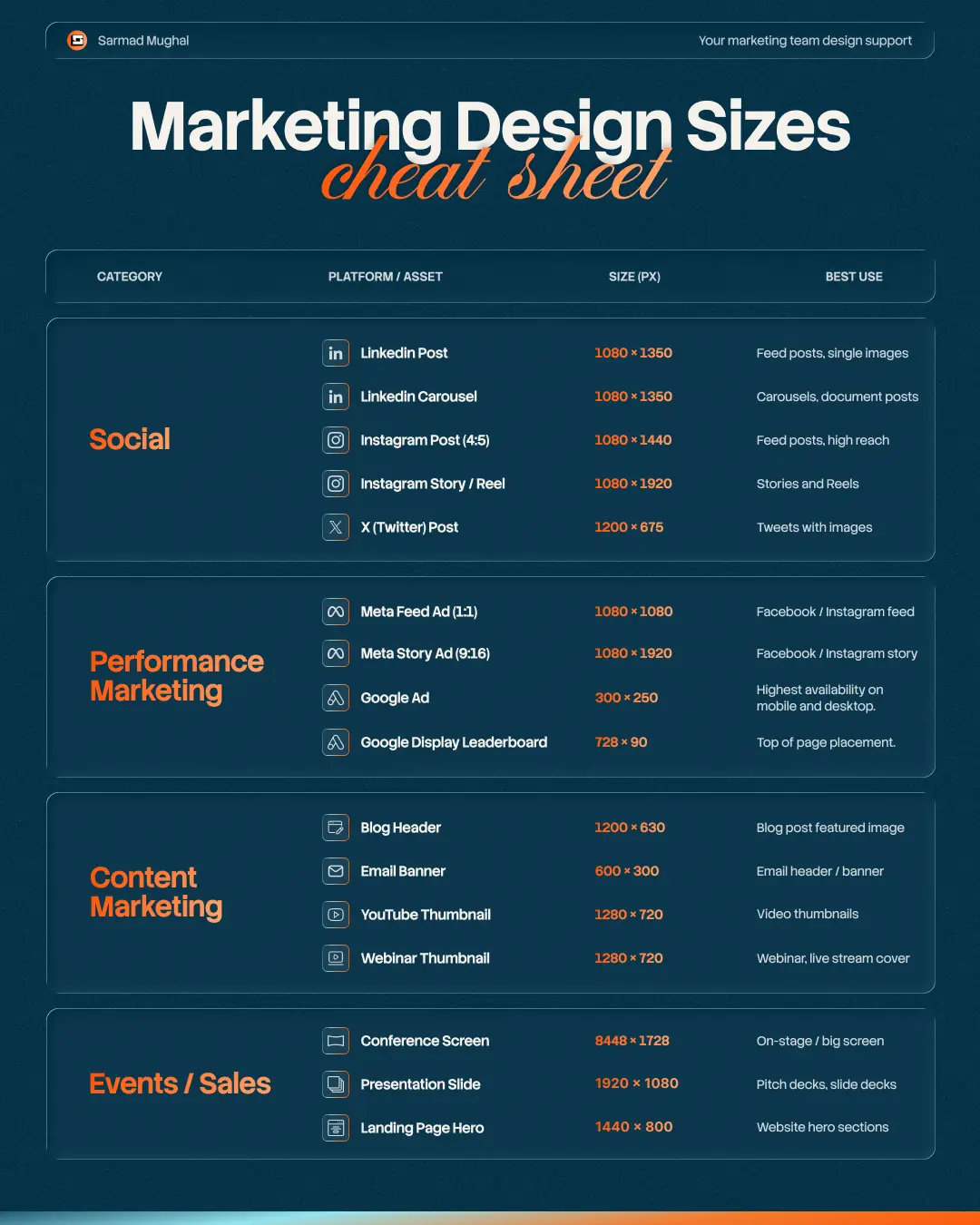
| Category | Asset | Size (px) | Best Use |
|---|---|---|---|
| Social | LinkedIn Post | 1080 × 1350 | Feed posts, single images |
| Social | LinkedIn Carousel | 1080 × 1350 | Carousels, document posts |
| Social | Instagram Post (4:5) | 1080 × 1440 | Feed posts, high reach |
| Social | Instagram Story / Reel | 1080 × 1920 | Stories and Reels |
| Social | X (Twitter) Post | 1200 × 675 | Tweets with images |
| Performance | Meta Feed Ad (1:1) | 1080 × 1080 | Facebook / Instagram feed |
| Performance | Meta Story Ad (9:16) | 1080 × 1920 | Facebook / Instagram story |
| Performance | Google Ad (Medium Rectangle) | 300 × 250 | Highest availability mobile + desktop |
| Performance | Google Display Leaderboard | 728 × 90 | Top of page placement |
| Content | Blog Header | 1200 × 630 | Blog featured + social share |
| Content | Email Banner | 600 × 300 | Email header / banner |
| Content | YouTube Thumbnail | 1280 × 720 | Video thumbnails |
| Content | Webinar Thumbnail | 1280 × 720 | Webinar, live stream cover |
| Events / Sales | Conference Screen | 8448 × 1728 | On-stage / big screen |
| Events / Sales | Presentation Slide | 1920 × 1080 | Pitch decks, slide decks |
| Events / Sales | Landing Page Hero | 1440 × 800 | Website hero sections |
FAQ
What are the best social media image sizes 2026?
The best social media image sizes 2026 are 1080 × 1350 pixels for LinkedIn and Instagram feed posts, 1080 × 1920 pixels for Stories and Reels, and 1200 × 675 pixels for X. These dimensions match the native ratios of each platform and use the maximum feed real estate.
What size should a LinkedIn post be in 2026?
A LinkedIn post should be 1080 × 1350 pixels (4:5 vertical ratio). This is the largest size LinkedIn supports in the feed and gets the most screen space on mobile.
What is the best Instagram post size in 2026?
The best Instagram post size is 1080 × 1440 pixels (4:5 vertical ratio). This is the maximum size Instagram allows in the feed and gets significantly more reach than square 1:1 posts.
What is the standard Meta ad size?
The standard Meta ad size is 1080 × 1080 pixels (1:1 square). This works for both Facebook and Instagram feed placements with no cropping. For Stories and Reels ads, use 1080 × 1920 pixels.
What size should a blog header image be?
A blog header image should be 1200 × 630 pixels. This matches the Open Graph standard, so the same image works as the featured blog image and the social share preview.
Do social media image sizes change every year?
Yes. Platforms update their feed algorithms and aspect ratios regularly. The sizes in this guide are current for 2026. Check the platform’s official ad spec documentation before committing to a long-running campaign.
Conclusion
The right dimensions are the difference between creative that fills the screen and creative that gets buried. Save this cheat sheet. Send it to your marketing team. Use it as the default brief whenever you hand off design work.
If you are part of an in-house marketing team that needs consistent design support social posts, ad creatives, landing pages, decks, that is the work I do every day on retainer. Marketing teams hand me the brief, I ship the assets in the right size, on brand, on time.